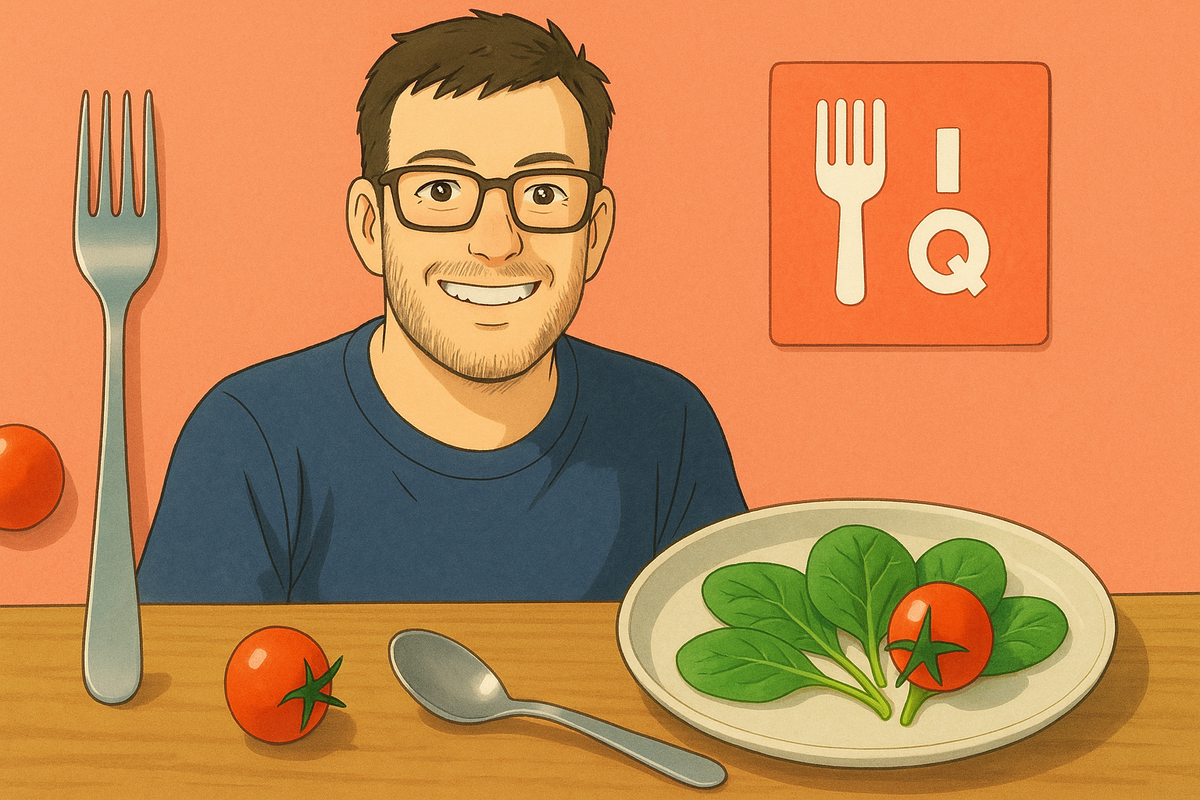
How I Built AteIQ in a Week (and Why I’m Glad I Did)

Back in May 2025, I found myself between roles. I wasn’t consulting. I wasn’t deep in client work. I wasn’t resting either.
I was floating.
Thinking, sketching, shipping bits of code here and there. What I needed was a creative constraint — something small and fast to build, but big enough to mean something.
That’s when I noticed a recurring frustration:
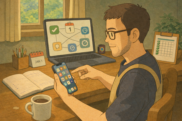
Every time I ate something, I wanted to log it — but hated the process.
Search. Tap. Weigh. Adjust. Back out. Repeat.
It felt like food tracking apps were designed to kill momentum, not support it.
So I asked a simple question:
What if you could just describe what you ate, like you would to a friend?
The Idea: Simpler Food Tracking Through Language
I wasn’t interested in building “yet another” nutrition app. I wanted something lighter — more like a journal with built-in intelligence.
- No barcode scanners
- No dropdowns
- No hunting through crowded databases
Just something like:
Two eggs on toast with some avocado and a black coffee.
And get back:
285 kcal • 17g protein • 18g fat • 14g carbs
That was the spark. The name followed quickly after:
AteIQ — smart, simple eating.
The Build: 7 Days from Idea to App Store
This wasn’t something I’d been secretly working on for months. I built AteIQ in a focused week — from first commit to App Store submission.
Each day started with coffee and one question:
What’s the smallest possible thing that would still feel magical?
I designed fast. Coded faster. Reused what I could. Built the landing page ateiq.app over lunch.
Tech Stack:
- SwiftUI + Swift Concurrency (
async/await) - SwiftData for local storage
- OpenAI (via API) for natural language interpretation
- HealthKit for Pro features
- RevenueCat for IAP and subscriptions
What Shipped in v1
The first release was tight by design. It included:
- A simple input screen for natural language meal descriptions
- AI-powered nutrition analysis
- A timeline-style history view
- 3 logs per day on the free tier
- Unlimited logging, HealthKit sync, and feature previews for Pro users
No bloat. Just enough to deliver real value.
The Philosophy: Small, Lovable, Complete
I’ve been thinking a lot about SLC — small, lovable, complete — instead of MVPs that often feel broken or rushed.
For AteIQ, that meant:
- No custom meal templates (yet)
- No barcode scanning
- No nutrient graphs or analytics dashboards
- No rigid calorie goals or macro plans
But instead:
- Yes to fast, natural logging
- Yes to beautiful summaries
- Yes to a calm, focused UI
- Yes to just enough value to feel useful, with a reason to upgrade
The Outcome: Something I’m Proud Of
AteIQ launched publicly in May 2025, and to my surprise — people started using it. Daily.
It’s helping others (and me) reflect more intentionally on what they eat. That’s enough to feel proud of.
Now I’m slowly adding new features — like saved meals, smarter re-analysis, and better history tools — but with the same constraint:
Every feature has to feel intentional, not just more.
If You’re Thinking About Building Something…
Start.
Small.
Scoped.
Focused.
Use tools you trust. Solve something you care about.
And build what feels right — even if nobody asked for it yet.
Where to Try It
This post unpacked the week-long sprint that became AteIQ — and why keeping it small, focused, and human was the right call.
I’ll be sharing more behind-the-scenes notes on product thinking, fast iteration, and the indie dev life.
If you’re exploring this space too, I’d genuinely love to connect or you can drop me a line.
And if you're just getting started, I hope this blog becomes a place you revisit and grow alongside.
Until next time — build what feels right.